E-commerce Data Analysis Part Three - RFM Customer Segmentation
17 Nov 2020Introduction:
In Part Three of the E-Commerce data series, we will create customer segmentations based on RFM method and the Jenks natural breaks algorithm. Before we jumping into the analytical part, we would adopt the same step to clean the data as the part one article. In this part of RFM Customer Segmentaion, a RFM score will be assigned to each customer.
We would use this RFM score to decide which group of segement the customer is belong to:
- Engaged
- Not-Engaged
- Best
For RFM clustering, instead of using kmeans, we will use Jenks natural breaks algorithm. For the purposes of this article, I will use jenkspy from Matthieu Viry.
Table Of Content:
- Data Wrangling
- RFM Method
- Recency (When is customer’s most recent purchase?)
- Frequency (How many times customer purchased on-line from your platform?)
- Monetary (How much customer spend on-line during this time period?)
-
Caculate RFM scores
- Data Visualization 2D Scatter Plot.
Data Wrangling - Exploratory Data Analysis
# Setting up the environment
import pandas as pd
import numpy as np
import datetime as dt
import matplotlib.pyplot as plt
from operator import attrgetter
import seaborn as sns
import matplotlib.colors as mcolors
# Import Data
data = pd.read_csv("OnlineRetail.csv",engine="python")

# Change InvoiceDate data type
data['InvoiceDate'] = pd.to_datetime(data['InvoiceDate'])
# Convert to InvoiceDate hours to the same mid-night time.
data['date']=data['InvoiceDate'].dt.normalize()

# Summerize the null value in dataframe.
print(data.isnull().sum())
# Missing values percentage
missing_percentage = data.isnull().sum() / data.shape[0] * 100

# How often a record without description is also missing unit price information and customerID
data[data.Description.isnull()].CustomerID.isnull().value_counts()
data[data.Description.isnull()].UnitPrice.isnull().value_counts()
InvoiceNo           0
StockCode           0
Description      1454
Quantity            0
InvoiceDate         0
UnitPrice           0
CustomerID     135080
Country             0
date                0
dtype: int64


False    1454
Name: UnitPrice, dtype: int64
It’s better to change $InvoiceDate$ column in to $datatime64(ns)$ types for future data analysis on monthly revenue growth. In this project, we would ignore the hours and minutes within $InvoiceDate$ column, only the day,month,year will be stored in the dataframe.
Around 25% of rows wihtin $CustomerID$ column is missing values, this would impose a question mark on the implementation of digital tracking system for any business. We normally would look into more details but in this case, we do not have any visibilities on them. Let’s continue to explore the missing values in $Description$ and $UnitPrice$ Column.
data.loc[data.CustomerID.isnull(), ["UnitPrice", "Quantity"]].describe()
| UnitPrice | Quantity | |
|---|---|---|
| count | 135080.000000 | 135080.000000 |
| mean | 8.076577 | 1.995573 |
| std | 151.900816 | 66.696153 |
| min | -11062.060000 | -9600.000000 |
| 25% | 1.630000 | 1.000000 |
| 50% | 3.290000 | 1.000000 |
| 75% | 5.450000 | 3.000000 |
| max | 17836.460000 | 5568.000000 |
It is fair to say ‘UnitePirce’ and ‘Quantity’ column shows extreme outliers. As we need to use historical purhcase price and quantity to make sale forcast in the future, these outliers can be disruptive. Therefore, let us dorp of the null values. Besides dropping all the missing values in description column. How about the hidden values? like ‘nan’ instead of ‘NaN’. In the next following steps we will drop any rows with ‘nan’ and ‘’ strings in it.
Data Wrangling - Data Cleaning
# Can we find any hidden Null values? "nan"-Strings? in Description
data.loc[data.Description.isnull()==False, "lowercase_descriptions"] =  data.loc[
    data.Description.isnull()==False,"Description"].apply(lambda l: l.lower())

data.lowercase_descriptions.dropna().apply(
    lambda l: np.where("nan" in l, True, False)).value_counts()

# How about "" in Description?
data.lowercase_descriptions.dropna().apply(
    lambda l: np.where("" == l, True, False)).value_counts()
False    540455
Name: lowercase_descriptions, dtype: int64
# Transform "nan" toward "NaN"
data.loc[data.lowercase_descriptions.isnull()==False, "lowercase_descriptions"] = data.loc[
    data.lowercase_descriptions.isnull()==False, "lowercase_descriptions"
].apply(lambda l: np.where("nan" in l, None, l))

# Verified all the 'nan' changed into 'Nan'
data.lowercase_descriptions.dropna().apply(lambda l: np.where("nan" in l, True, False)).value_counts()
False    539724
Name: lowercase_descriptions, dtype: int64
#drop all the null values and hidden-null values
data.loc[(data.CustomerID.isnull()==False)&(data.lowercase_descriptions.isnull()==False)].info()

# data without any null values
data_clean = data.loc[(data.CustomerID.isnull()==False)&(data.lowercase_descriptions.isnull()==False)].copy()
data_clean.isnull().sum().sum()
<class 'pandas.core.frame.DataFrame'>
Int64Index: 406223 entries, 0 to 541908
Data columns (total 10 columns):
InvoiceNo                 406223 non-null object
StockCode                 406223 non-null object
Description               406223 non-null object
Quantity                  406223 non-null int64
InvoiceDate               406223 non-null datetime64[ns]
UnitPrice                 406223 non-null float64
CustomerID                406223 non-null float64
Country                   406223 non-null object
date                      406223 non-null datetime64[ns]
lowercase_descriptions    406223 non-null object
dtypes: datetime64[ns](2), float64(2), int64(1), object(5)
memory usage: 34.1+ MB


0
# Only pick the date from 12-01-2010 to 11-30-2011.
data_clean = data_clean[data_clean.InvoiceDate.between('12-01-2010', '11-30-2011')]
RFM Method - Recency
import jenkspy
from scipy import stats
from scipy.stats import norm, skew

# Recency
rfm_data = data_clean.copy()
rfm_user = pd.DataFrame(data_clean['CustomerID'].unique())
rfm_user.columns = ['CustomerID']

recency_max_date = data_clean.groupby('CustomerID').InvoiceDate.max().reset_index()
recency_max_date.columns = ['CustomerID','MaxDate']

recency_max_date['Recency'] = (recency_max_date['MaxDate'].max() - recency_max_date['MaxDate']).dt.days
rfm_user = pd.merge(rfm_user, recency_max_date[['CustomerID','Recency']], on='CustomerID')

# Jenks optimization or natural breaks
breaks = jenkspy.jenks_breaks(rfm_user['Recency'], nb_class=4)
rfm_user['Recency_Cluster'] = pd.cut(rfm_user['Recency'], bins=breaks, labels=['class_1', 'class_2', 'class_3', 'class_4'], include_lowest=True)

rfm_user
| CustomerID | Recency | Recency_Cluster | |
|---|---|---|---|
| 0 | 17850.0 | 292 | class_4 |
| 1 | 13047.0 | 21 | class_1 |
| 2 | 12583.0 | 8 | class_1 |
| 3 | 13748.0 | 85 | class_2 |
| 4 | 15100.0 | 320 | class_4 |
| ... | ... | ... | ... |
| 4321 | 16479.0 | 0 | class_1 |
| 4322 | 13428.0 | 0 | class_1 |
| 4323 | 15790.0 | 0 | class_1 |
| 4324 | 13521.0 | 0 | class_1 |
| 4325 | 14349.0 | 0 | class_1 |
4326 rows × 3 columns
# Visualization
data =  rfm_user.Recency
plt.figure(figsize=(16,5))

plt.subplot(1,2,1)
sns.distplot(data, bins=30)
(mu, sigma) = norm.fit(data)
print( '\n mu = {:.2f} and sigma = {:.2f}\n'.format(mu, sigma))
plt.legend(['Normal dist. ($\mu=$ {:.2f} and $\sigma=$ {:.2f} )'.format(mu, sigma)],loc='best')
plt.ylabel('Frequency')
plt.title('Recency Distribution (All Customers)')

plt.subplot(1,2,2)
sns.boxplot(data)
plt.title('Recency Boxplot (All Customers)')
plt.show()

stats.skew(data)
rfm_user.groupby('Recency_Cluster')['Recency'].describe()
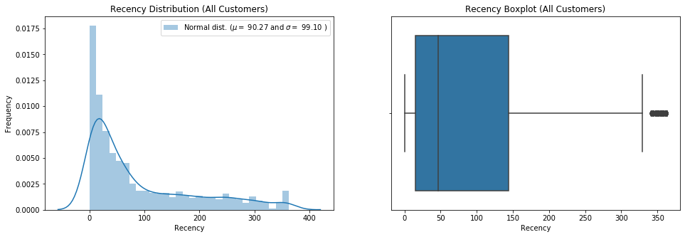
mu = 90.27 and sigma = 99.10
| count | mean | std | min | 25% | 50% | 75% | max | |
|---|---|---|---|---|---|---|---|---|
| Recency_Cluster | ||||||||
| class_1 | 2167.0 | 17.795570 | 13.145651 | 0.0 | 7.0 | 15.0 | 27.00 | 47.0 |
| class_2 | 983.0 | 77.385554 | 23.060994 | 48.0 | 57.0 | 71.0 | 96.00 | 128.0 |
| class_3 | 648.0 | 181.538580 | 32.047710 | 130.0 | 154.0 | 179.0 | 208.00 | 240.0 |
| class_4 | 528.0 | 299.731061 | 39.306363 | 242.0 | 265.0 | 296.0 | 342.25 | 363.0 |
From the distribution chart and bar-chart, we know the average recency for all the customers is 91.05 days and the standard deviation is 100.75. If we look into the details of class 1 recency_cluster group which accounts for around 50% customers, the average recency is only 17 days.
We have added one function to our code which is order_cluster( ). Fisher-Jenks algorithm assigns clusters as numbers but we need to have a numerical type of data to caculate the RFM score in the later chapter. order_cluster() method does this for us and our new dataframe looks much neater:
#function for ordering cluster numbers
def order_cluster(cluster_field_name, target_field_name,df,ascending):
    new_cluster_field_name = 'new_' + cluster_field_name
    df_new = df.groupby(cluster_field_name)[target_field_name].mean().reset_index()
    df_new = df_new.sort_values(by=target_field_name,ascending=ascending).reset_index(drop=True)
    df_new['index'] = df_new.index
    df_final = pd.merge(df,df_new[[cluster_field_name,'index']], on=cluster_field_name)
    df_final = df_final.drop([cluster_field_name],axis=1)
    df_final = df_final.rename(columns={"index":cluster_field_name})
    return df_final

rfm_user = order_cluster('Recency_Cluster', 'Recency', rfm_user,False)
rfm_user.groupby('Recency_Cluster')['Recency'].describe()
| count | mean | std | min | 25% | 50% | 75% | max | |
|---|---|---|---|---|---|---|---|---|
| Recency_Cluster | ||||||||
| 0 | 528.0 | 299.731061 | 39.306363 | 242.0 | 265.0 | 296.0 | 342.25 | 363.0 |
| 1 | 648.0 | 181.538580 | 32.047710 | 130.0 | 154.0 | 179.0 | 208.00 | 240.0 |
| 2 | 983.0 | 77.385554 | 23.060994 | 48.0 | 57.0 | 71.0 | 96.00 | 128.0 |
| 3 | 2167.0 | 17.795570 | 13.145651 | 0.0 | 7.0 | 15.0 | 27.00 | 47.0 |
RFM Method - Frequency
# Frequency
rfm_frequency = data_clean.groupby('CustomerID').InvoiceDate.count().reset_index()
rfm_frequency.columns = ['CustomerID','Frequency']
rfm_user = pd.merge(rfm_user, rfm_frequency, on='CustomerID')

# Jenks optimization or natural breaks
breaks = jenkspy.jenks_breaks(rfm_user['Frequency'], nb_class=4)
rfm_user['Frequency_Cluster'] = pd.cut(rfm_user['Frequency'], bins=breaks, labels=['class_1', 'class_2', 'class_3', 'class_4'], include_lowest=True)
rfm_user = order_cluster('Frequency_Cluster','Frequency',rfm_user,False)

# Visualization
data =  rfm_user.Frequency
plt.figure(figsize=(16,5))

plt.subplot(1,2,1)
sns.distplot(data, bins=30)
(mu, sigma) = norm.fit(data)
print( '\n mu = {:.2f} and sigma = {:.2f}\n'.format(mu, sigma))
plt.legend(['Normal dist. ($\mu=$ {:.2f} and $\sigma=$ {:.2f} )'.format(mu, sigma)],loc='best')
plt.ylabel('Frequency')
plt.title('Frequency Distribution (All Customers)')

plt.subplot(1,2,2)
sns.boxplot(data)
plt.title('Frequency Boxplot (All Customers)')
plt.show()

stats.skew(data)

rfm_user.groupby('Frequency_Cluster')['Frequency'].describe()
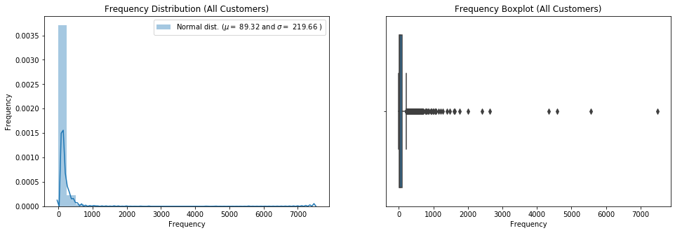
mu = 89.32 and sigma = 219.66
| count | mean | std | min | 25% | 50% | 75% | max | |
|---|---|---|---|---|---|---|---|---|
| Frequency_Cluster | ||||||||
| 0 | 4.0 | 5492.500000 | 1436.706999 | 4332.0 | 4523.25 | 5070.0 | 6039.25 | 7498.0 |
| 1 | 23.0 | 1322.260870 | 489.405968 | 838.0 | 991.50 | 1077.0 | 1538.00 | 2644.0 |
| 2 | 454.0 | 321.682819 | 126.384678 | 186.0 | 221.00 | 283.5 | 389.50 | 814.0 |
| 3 | 3845.0 | 48.887906 | 44.178125 | 1.0 | 15.00 | 33.0 | 72.00 | 185.0 |
However, We can easily spot there are outliers which is extreme high on frequncy and spent a big amount of money. This kind of abnormal acitivities needs more research and these group of customer might have big potentional. But one possible explaination is the ingeniuous orders created by bots to inflate the numbers.
RFM Method - Monetary
# Revenue
# Create Revenue Column
data_clean['Revenue'] = data_clean['UnitPrice'] * data_clean['Quantity']


rfm_revenue = data_clean.groupby('CustomerID').Revenue.sum().reset_index()
rfm_user = pd.merge(rfm_user, rfm_revenue[['CustomerID', 'Revenue']], on='CustomerID')
# Jenks optimization or natural breaks
breaks = jenkspy.jenks_breaks(rfm_user['Revenue'], nb_class=4)
rfm_user['Revenue_Cluster'] = pd.cut(rfm_user['Revenue'], bins=breaks, labels=['class_1', 'class_2', 'class_3', 'class_4'], include_lowest=True)
rfm_user = order_cluster('Revenue_Cluster','Revenue',rfm_user,False)

# Visualization
data =  rfm_user.Revenue
plt.figure(figsize=(16,5))

plt.subplot(1,2,1)
sns.distplot(data, bins=30)
(mu, sigma) = norm.fit(data)
print( '\n mu = {:.2f} and sigma = {:.2f}\n'.format(mu, sigma))
plt.legend(['Normal dist. ($\mu=$ {:.2f} and $\sigma=$ {:.2f} )'.format(mu, sigma)],loc='best')
plt.ylabel('Frequency')
plt.title('Frequency Distribution (All Users)')

plt.subplot(1,2,2)
sns.boxplot(data)
plt.title('Frequency Boxplot (All Users)')
plt.show()

stats.skew(data)

rfm_user.groupby('Revenue_Cluster')['Revenue'].describe()
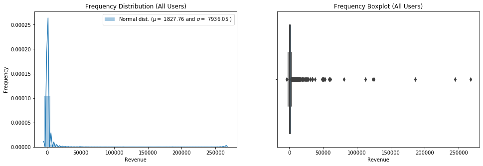
mu = 1827.76 and sigma = 7936.05
| count | mean | std | min | 25% | 50% | 75% | max | |
|---|---|---|---|---|---|---|---|---|
| Revenue_Cluster | ||||||||
| 0 | 3.0 | 232830.956667 | 42177.542186 | 185919.77 | 215436.3600 | 244952.950 | 256286.5500 | 267620.15 |
| 1 | 4.0 | 110415.265000 | 20565.272334 | 80676.46 | 104636.6875 | 118139.640 | 123918.2175 | 124705.32 |
| 2 | 33.0 | 35337.012727 | 13585.641527 | 18769.32 | 25079.6000 | 30722.530 | 49957.4800 | 60490.10 |
| 3 | 4286.0 | 1306.718804 | 1947.475884 | -4287.63 | 287.4475 | 622.925 | 1504.5175 | 17588.26 |
Caculate RFM Score
import numpy as np
rfm_user['RFM_Score'] = rfm_user['Recency_Cluster']+rfm_user['Frequency_Cluster']+rfm_user['Revenue_Cluster']
rfm_user.groupby('RFM_Score').agg({'Recency': 'mean', 'Frequency': 'mean', 'Revenue': 'mean'})
| Recency | Frequency | Revenue | |
|---|---|---|---|
| RFM_Score | |||
| 4 | 3.500000 | 3775.000000 | 196162.735000 |
| 5 | 66.888889 | 2231.777778 | 83110.871111 |
| 6 | 293.765683 | 44.636531 | 1030.785775 |
| 7 | 167.531557 | 76.617111 | 1546.853844 |
| 8 | 58.872645 | 126.197438 | 2195.281365 |
| 9 | 19.113676 | 64.904212 | 1264.753480 |
Customer Segments - Best, Engaged, Not Engaged
# rfm_user['Segment'] = rfm_user['Segment'].astype(str)
rfm_user['Segment'] = 'Not-Engaged'
rfm_user.loc[rfm_user['RFM_Score'] > 6,'Segment'] = 'Engaged'
rfm_user.loc[rfm_user['RFM_Score'] > 7,'Segment'] = 'Best'

#creating new cluster dataframe
ltv_cluster = rfm_user.copy()
seg = ltv_cluster.groupby('Segment')['Revenue'].describe().reset_index()
seg = seg.iloc[:,[0,1,2]]
seg.columns = ['Segment', 'Customers', 'Revenue(avg)']
seg['Segments'] = pd.Series(['Best', 'Engaged', 'Not Engaged'])
segments = seg[['Segments', 'Customers', 'Revenue(avg)']]
segments
| Segments | Customers | Revenue(avg) | |
|---|---|---|---|
| 0 | Best | 3060.0 | 1668.286325 |
| 1 | Engaged | 713.0 | 1546.853844 |
| 2 | Not Engaged | 553.0 | 3072.349367 |
Data Visualization
# Exclude CustomerID with Extreme-High Frequency Purchase records / Bot Traffic
rfm_user = rfm_user[rfm_user['Frequency']<2000]
plot = rfm_user.copy()

# Exclude Return Orders
plot.loc[plot['Revenue'] < 0, 'Revenue'] = 0


# 2D Visualization
sns.set(style="white")
sns.relplot(x="Recency", y="Frequency", hue="Segment", size="Revenue",sizes=(40, 400), alpha=.5, palette="muted",height=6, aspect=2, data=plot)
sns.despine(left=True, bottom=True);
Conclusion:
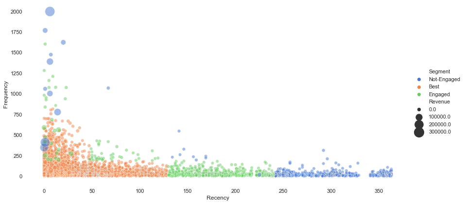
From the scatter plot above, the size of the dots indicate how much people spend on-line shopping within the platform. In general, we can see most of our customers which belong to best group purchased on-line within 150 days with frequency lower than 1000 times. Not-engaged customers only had purchase record more than 250 days.